[this is a version of a post which first appeared on my blog From the Front of the Choir]
One of the many bees in my bonnet is the photographs of choirs.

I have yet to see a photo of any reasonably sized choir (say, over 30 members) which is of any interest to me whatsoever.
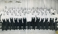
Almost always the photo is of rows of identically dressed people looking straight to camera. It screams CHOIR in the most stereotyped, dull, predictable way.
I pick up the newspaper and read an article about an upcoming choral concert or maybe a review of one, and most of the time it is accompanied by an obvious photo of a choir.
I’ve just read that fact, and now to reinforce it (in case I hadn’t grasped what the word ‘choir’ means) I’m confronted with an amazingly boring photo which adds nothing to the piece. Why say the same thing twice?
I believe this does the choral world a disservice. It perpetuates the conservative old-fashioned view of what a choir is (see also Avoiding the ‘C’ word).
I don’t think it helps attract audiences at all. If an audience already knows what a choir looks like, it’s not going to mean anything, and if they don’t, it will almost certainly put them off!
Why, oh, why can’t we have interesting photos of choirs??!!! (OK, I’m sure there are some out there and I would love to be inundated with exciting examples).
As with most successful marketing, the image used in publicity doesn’t necessarily have to be a literal interpretation of the thing being sold.
Very often in the performing arts, the publicity photo is not a still from rehearsals (this is reserved for the world of amateur dramatics or the photo display in the foyer), but a carefully thought-out image that somehow sums up an overall impression of the performance.
For example, when WorldSong performed at Coventry’s Belgrade Theatre, their marketing department told us that, from years of research, they had discovered that images of nature helped to sell musical events most effectively. Our posters were based around the image of a tree and it was so successful that we stole the idea for our first CD cover.
Yet some media outlets will still insist on an actual photo of the choir itself.
OK. Fair enough. Local press is usually interested in the ‘human interest’ side of things, so let’s give them a photo of the people in the choir. But why in a static, formal, boring pose? Why not something different and exciting?
Of course, there is a problem here in that it is difficult in practice to get every member of a large group to fit into a photo at a decent scale so we can see their faces.
The easiest solution to this is the typical group or school photo: stand in rows with the tallest at the back, the shortest in front and maybe even some people right at the front sitting on the floor. Yes, it gets everyone in the photo, but it is very predictable and not exciting in the slightest. The only use for such a photo is that little Johnny’s mum can actually see her darling boy.
Some people try to use performance photos of their choir. It’s a great idea, but trying to capture the energy and spirit of a choir in full voice is very, very hard. Most often we catch people in mid song with their mouths open, but their eyes half shut looking completely gormless. I have many examples of this, but won’t inflict them on you.
There are, however, other solutions. I’m not going to be specific here because I want to keep hold of some good ideas to use with my own choir! Suffice it to say, there are interesting ways of photographing choirs. However, it’s difficult finding good photographers who agree with me.
Please, please send me some good examples of choir photos.
Chris Rowbury: chrisrowbury.com